 English
 عربى
عربى Deutsch
 Español
 Français
 русский
 日本語
日本語 简体中文
简体中文Content
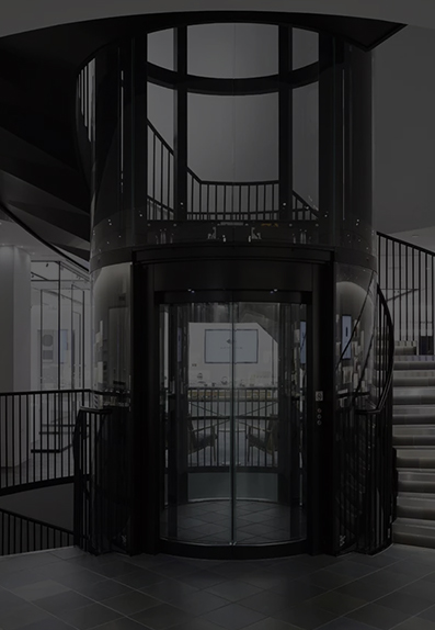
We step into elevators dozens of times a week, often without a second thought for the panel directly in front of us. Yet, this small space—the elevator background board—is a critical nexus of information, branding, safety, and user experience. A poorly designed board creates confusion, delays, and a subtle but tangible sense of institutional neglect. A well-designed one, however, operates seamlessly, guiding occupants efficiently and reinforcing a positive impression of the building.
Designing an elevator background board is not about mere decoration; it’s an exercise in functional communication design. This article breaks down the essential factors to consider, moving from core fundamentals to advanced integration, ensuring your next design is both beautiful and brilliantly effective.
Part 1: The Foundational Triad: Durability, Information, and Clarity
Before a single pixel is designed or a material is sourced, three core principles must guide every decision. Ignoring these is the primary reason elevator boards fail.
1.1 Material and Durability: The Uncompromising Foundation
The elevator cab is a high-traffic, high-abuse environment. Your design must be built to last. The choice of material is the first and most critical decision.
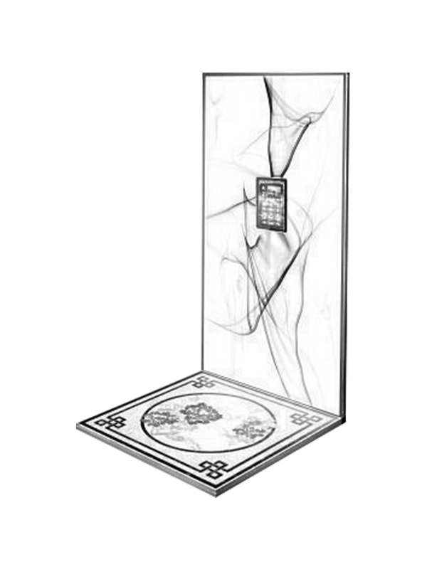
Laminated Plastic (e.g., Polycarbonate or Acrylic): This is the most common and versatile choice. It’s cost-effective, lightweight, and can be printed directly onto with high-quality UV printers. Opt for a matte or anti-glare finish to prevent reflections from overhead lights, which can make text difficult to read. The lamination protects the print from scuffs, scratches, and fading.
Stainless Steel (Etched or Printed): For a premium, modern, or industrial aesthetic, stainless steel is excellent. Information can be etched, engraved, or printed onto the surface. It is incredibly durable, scratch-resistant, and easy to clean. However, it is more expensive and can show fingerprints.
Glass (Frosted or Printed): Glass offers a sleek, high-end look, often used in corporate headquarters or luxury residences. It can be frosted for privacy and then printed on, or have a vinyl applique applied. Its primary drawback is fragility and cost, both in initial installation and potential replacement.
Anodized Aluminum: A great middle ground, offering the sleekness of metal with less weight and cost than stainless steel. It is highly resistant to corrosion and wear.
Practical Takeaway: Always request material samples. Test them for scratch resistance with a key and clean them with a standard cleaning spray to check for smudging. Your material choice dictates not just aesthetics but the long-term maintenance budget.
1.2 Information Hierarchy: Guiding the Eye in Seconds
An occupant typically has between 10 to 60 seconds to absorb the information on your board. A chaotic layout forces them to search, creating frustration. A clear hierarchy guides them effortlessly.
Primary Information: This is what every single person needs to see immediately. It consists of the Floor Numbers and Letters. This must be the largest, boldest, and most prominent element on the board.
Secondary Information: This includes building amenities . This should be smaller than the floor numbers but still clear and legible.
Tertiary Information: This is important but not immediately critical for navigation, such as the Firefighter Service icon, the Emergency Stop symbol, or the Alarm button label. These are often represented with universal icons and smaller text.
Static Branding: The building or company logo. It should be present but should never compete with the primary information for attention.
Practical Takeaway: Before you design, list every piece of information that must be on the board. Then, assign it a level: P (Primary), S (Secondary), or T (Tertiary). Your design should reflect this ranking through stark differences in font size and weight.
1.3 Legibility and Typography: The Science of Readability
Typography is a tool, not a decorative element. Poor font choices render the best hierarchy useless.
Font Choice: Always choose a sans-serif font. Serif fonts (like Times New Roman) have small decorative strokes that can blur at smaller sizes or under less-than-ideal lighting. Sans-serif fonts like Helvetica, Arial, Frutiger, or Univers are clean, modern, and highly legible. Avoid script, novelty, or overly condensed fonts at all costs.
Font Weight and Size: Primary floor indicators should be bold and large. A good rule of thumb is that the tallest numeral (e.g., the number ‘1’) should be at least 1.5 to 2 inches high for easy reading from the back of a standard elevator. Secondary text can be a regular weight and significantly smaller, but never so small that it becomes a strain to read.
Color Contrast: This is non-negotiable. The contrast between the text and its background must be high. The gold standard is dark text on a light background (e.g., black on white) or white text on a very dark background (e.g., white on navy blue). Avoid light grey text on a medium-grey background. Use online contrast checkers to ensure your color pairings meet accessibility standards (WCAG AA minimum).
Part 2: The User Experience (UX) and Accessibility Layer
A board that is durable and legible is functional. A board that considers UX and accessibility is exceptional.
2.1 Universal Design and ADA Compliance
Designing for accessibility isn’t just a legal requirement (under the Americans with Disabilities Act and similar regulations worldwide); it’s a moral imperative and a mark of good design.
Braille and Tactile Characters: All floor identifiers and core amenity labels (G, L, P, etc.) must be accompanied by Grade 2 Braille. Furthermore, the numbers and letters themselves should be tactile, either raised or lowered from the surface. This allows visually impaired users to verify their selection by touch.
Visual Accessibility: As mentioned, high color contrast is crucial for those with low vision or color blindness. The use of clear, large fonts also benefits older adults and anyone in a hurry.
Mounting Height: The ADA specifies a mounting height for the button panel itself. While the background board surrounds it, the entire assembly must be installed within a compliant “reach range” to be usable by someone in a wheelchair. Typically, the highest operable part should be no higher than 48 inches, and the lowest no lower than 15 inches, from the floor.
2.2 Intuitive Layout and Cognitive Flow
How does the human eye naturally scan information?
The “F-Pattern”: In Western cultures, we typically scan from top-left to bottom-right. The most common and intuitive layout is a grid system, with floors listed in descending numerical order from the top left. The top floor (e.g., 20) should be in the top-left corner, with floors 19, 18, etc., following in a logical grid or column beneath it. The ground floor (G or L) should be in a predictable location, often at the bottom of the first column.
Grouping and Spacing: Use proximity to group related items. All floor buttons should be visually grouped together. Amenity buttons (Pool, Gym) can be grouped in a separate, clearly defined section, perhaps with a subtle background tint or divider line. Ample “white space” (negative space) around groups and individual items prevents the design from feeling cluttered and overwhelming.
Part 3: Aesthetics, Branding, and Technical Integration
With the fundamentals and UX locked in, you can now focus on how the board integrates with the broader environment.
3.1 Cohesive Aesthetic and Brand Alignment
The elevator background board is a key component of the cab’s interior design. It should not look like an afterthought.
Style Consistency: Is the building’s interior modern? Consider a minimalist board with a monochromatic color scheme and a sleek typeface. Is it a classic, traditional building? A warmer color palette and a more substantial frame might be appropriate. The material, font, and color choices should feel like a natural extension of the elevator cab’s finishes (stainless steel walls, handrail, ceiling).
Branding Integration: For a corporate building, the company logo should be placed tastefully, typically at the top or bottom center of the board. It should be rendered in approved brand colors, but ensure it does not violate the legibility principles. If the brand color is light yellow, do not use it for text on a white background.
3.2 Illumination and Visibility
Elevators can be dimly lit, and people use them at all hours. How does your design perform in low light?
Backlit Panels: This is the premium solution. The entire background board is constructed from a translucent material (like acrylic) and lit from behind with energy-efficient LEDs. This creates an even, glowing effect that ensures perfect readability in any lighting condition and adds a high-end feel.
Button-Only Illumination: The standard solution is for only the individual buttons to illuminate when pressed. In this case, it is even more critical that the surrounding text and icons on the static board have high contrast, as they will not be self-illuminated.
3.3 Future-Proofing and Maintenance
A building’s lifecycle is measured in decades. Your design should account for the future.
Modularity: Is there a possibility of floors being added or re-purposed? Using a system with replaceable individual buttons or tiles, rather than a single printed sheet, can save enormous cost and hassle down the line.
Ease of Cleaning: The surface should be smooth and non-porous to allow for easy wiping and disinfecting. Deeply textured surfaces or porous materials can trap grime and bacteria.
Vendor Documentation: Ensure you receive a digital master file (e.g., .AI or .PDF) of the final design from the fabricator. If the board is ever damaged, you won’t have to re-design it from scratch.
Conclusion: More Than Just a Panel
The elevator background board is a small canvas with a disproportionately large job. It is a silent guide, a safety feature, a brand ambassador, and a testament to the thoughtfulness put into a building’s design. By systematically considering these factors—starting with the unbreakable foundation of durability and legibility, building up through the critical layers of user experience and accessibility, and finishing with seamless aesthetic and technical integration—you can transform this overlooked element into a masterpiece of functional design. The result is an elevator that doesn’t just move people between floors, but does so with efficiency, elegance, and respect for every single occupant.


